How effective is your combination of your main product and ancillary texts?
Our 3 products are the...
- Promotional Music Video
- Digipak
- Magazine advert
I believe we were successful in creating 3 products that effectively combined to create a promotional package for the release of the album/song. This is because all 3 are similar and yet work at an individual level. Moreover, when putting all 3 together, there are clear connections between them. This was because we listened closely to audience research and made sure that all 3 have synergistic links.
The synergistic links
 |
| Music video screenshot |
 |
| The outer cover for the digipak |
 |
| The poster |
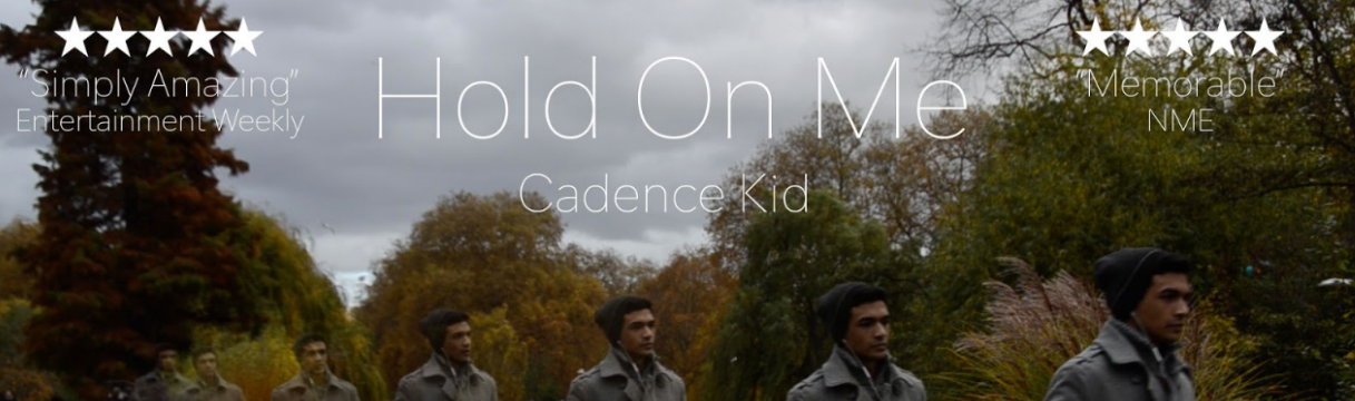
All three products contain the same image of the protagonist walking through St James' Park. This scene was used as it shows how the protagonist is going on a journey, as he remembers his date. In the digipak and advert it is identical, while in the music video, there is the scene from where we got the image from. We did this to create continuity between the three products, and it was effective as we received lots of feedback that people liked it, it was 'unique' and was very effective.
 |
| The opening shot from the music video |
 |
| The text on the front cover |
 |
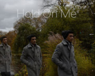
| The text on the poster |
When picking a font, we knew that it would have to work on a black background as we had decided where we were going to place it in the music video. Therefore we chose a simple, clean white font that stood out against the backdrop. This type of font is very popular with many YouTube vloggers as it can be easily read on a small screen, such as an iPhone. Using the same font throughout all 3 products meant we had another synergistic link. We decided to have the artist's name in a smaller font size as we felt the song is the important element we are trying to sell, not the artist.
 |
| Our protagonist |
In all 3 products, we used the same actor to play the protagonist. This was done as he plays a key role in the music video and so if someone had seen the video on the internet, and then while out in town had seen the advert or the digipak, could make a clear connection and investigate further. Having our protagonist wear smart yet casual clothes would create a character that the majority of teens today, the largest age group that listen to indie music, can relate to.
- We used the same colour scheme as we didn't want to edit a raw date. The story is meant to be very realistic and having scenes that are too heavily edited would ruin this illusion. Therefore we stuck with the grey skyline and the dull colours, like the grey the protagonist is wearing.
- The simple editing mirrors the simpleness of the indie genre and how lots of the songs are just a singer and a guitar. An audience would see the simple digipak and cover, and if they were a fan of the indie genre, would pick up the song.
Other examples
Adele - '21'
 |
| Digipak |
 |
| Advert |
Arctic Monkeys - '
AM'
 |
| Digipak |
 |
| Advert |
Conclusion
Overall, our 3 products worked very effectively with each other as the audience can make clear links between them, thus creating more audience consumption. Each piece compliments the others by adding something unique, yet still keeping the key concepts.


No comments:
Post a Comment